Connecting Policy to Real Life for Cornell University Fundraisers
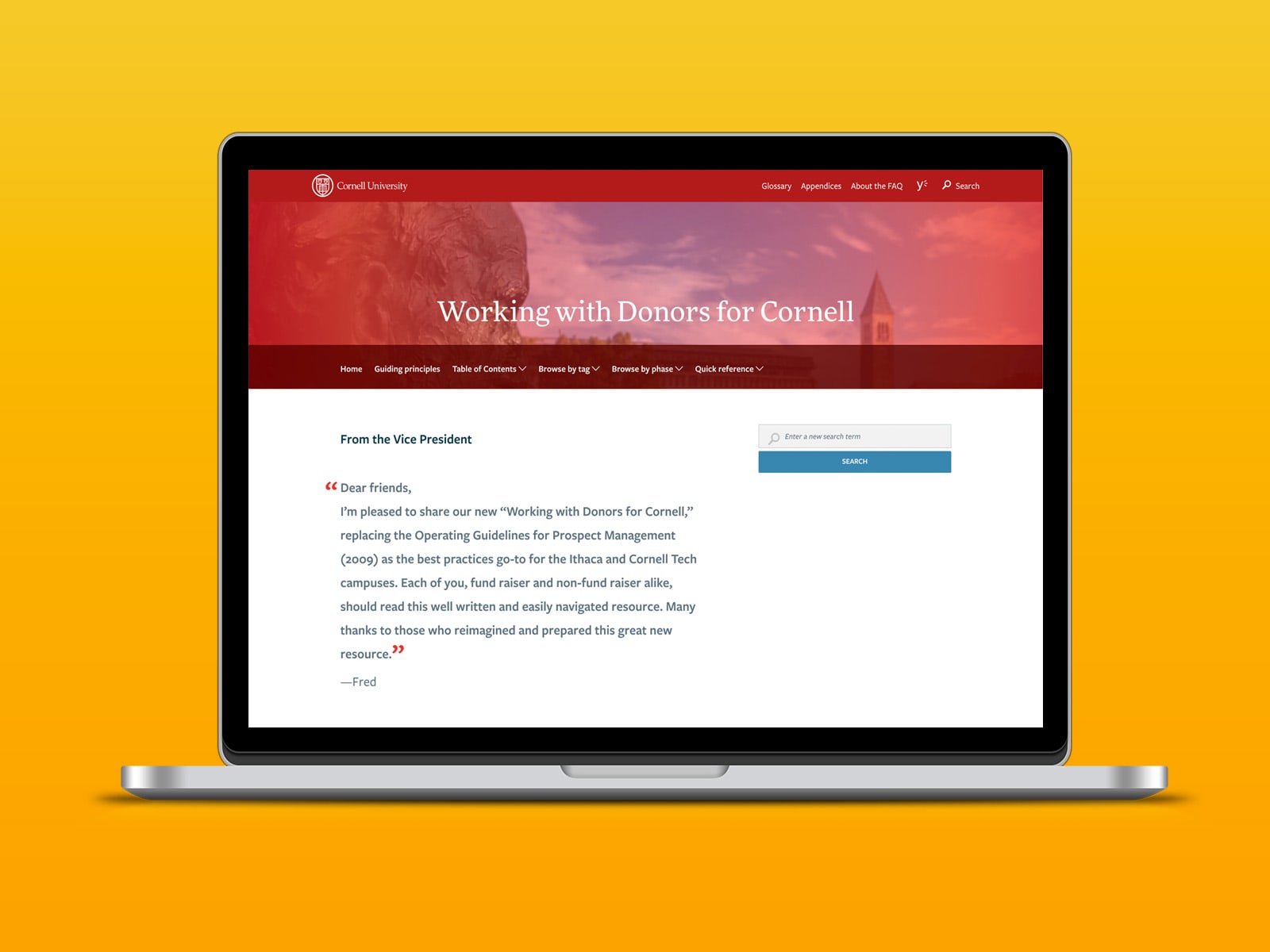
Cornell University Alumni Affairs and Development needed to digitize their guidelines for working with donors. The goal was to turn a static PDF into a living document that will be a source of truth for fundraisers across the university.
Challenges
Restrictions included that the intranet had limited search functionality, and the content needed to stay within an FAQ structure.
 View full size
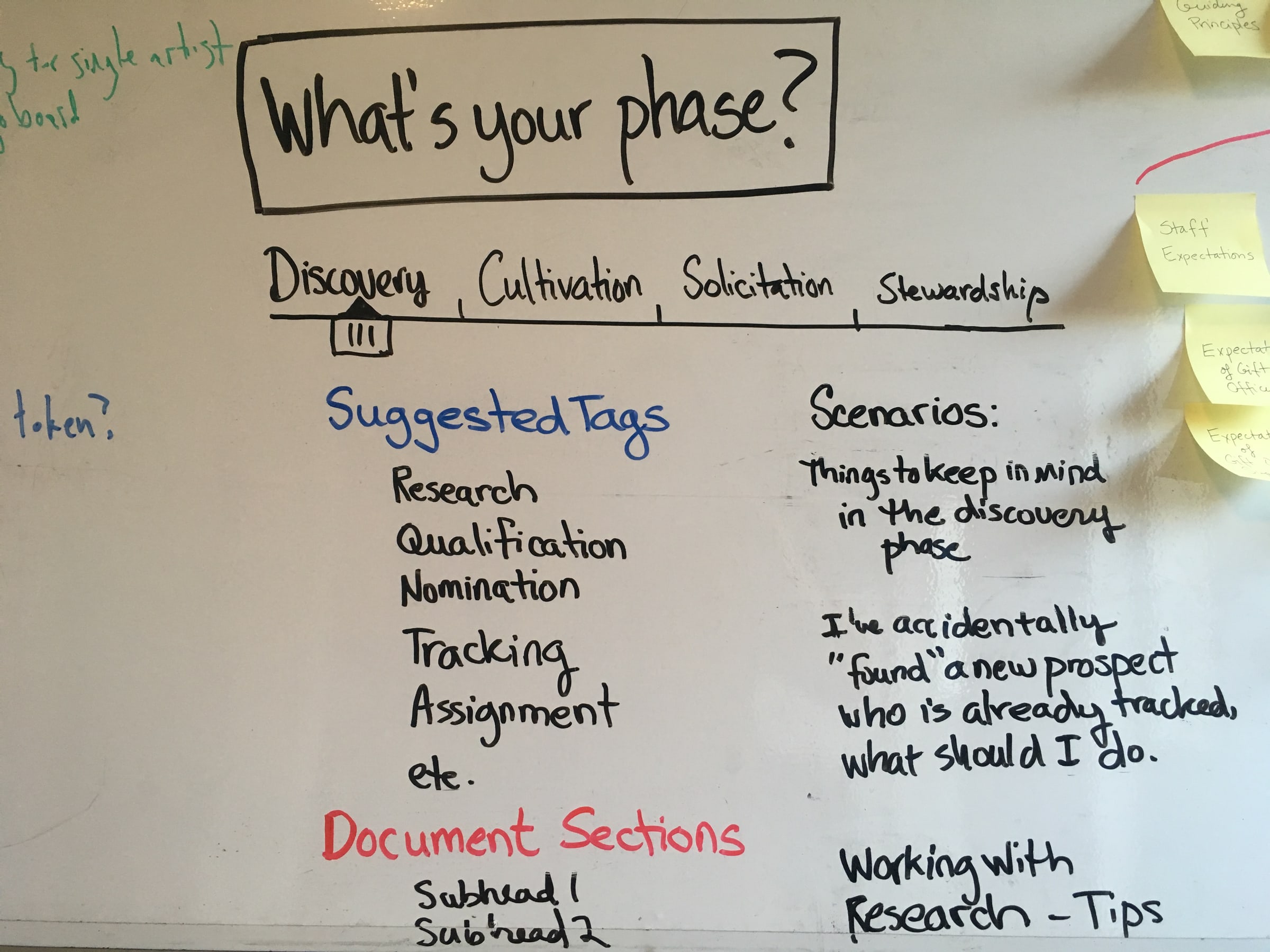
To succeed with this project I needed to make sure the navigation and structure of the new document suited the mindset and ways of working familiar to the full range of fundraisers across the many departments and colleges of the university. I performed qualitative user research to better understand the needs and challenges faced by Cornell's fundraisers.
 View full size
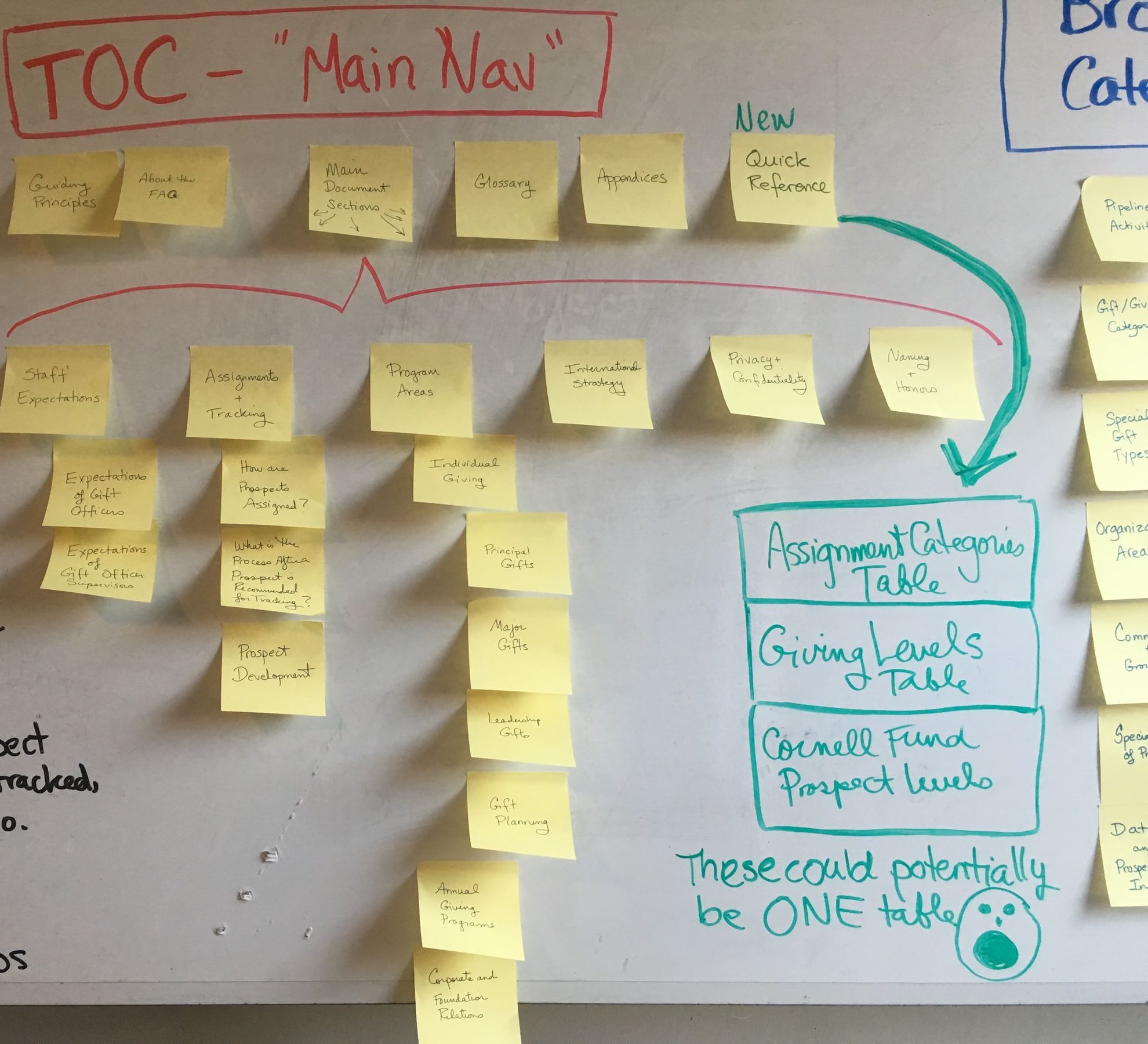
I interviewed 20 stakeholders from college deans, to associate and major gifts officers. Our conversations gave me insight into both their day-to-day tasks and the bigger picture of their role in the process that helped contextualize their professional activities. After analyzing the research, I delivered my findings in a report including proposed navigational structures and a layout to support browsing and searching methods of discovery.
 View full size
How would the fundraisers know to search for information if they didn't know it existed in the first place? To solve this, I developed a browsing strategy that encourages discovery and exploration of the content, framed in language that aligns with how the users think about their work.
 View full size
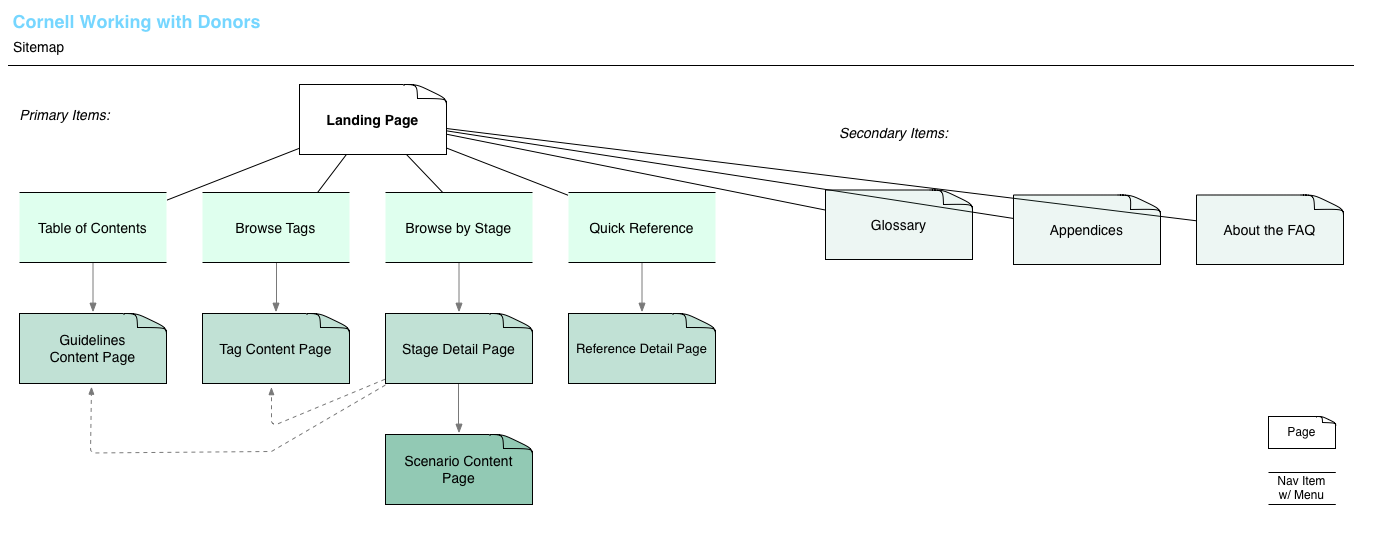
The sitemap solidified the plan for navigation and the structure of the site.
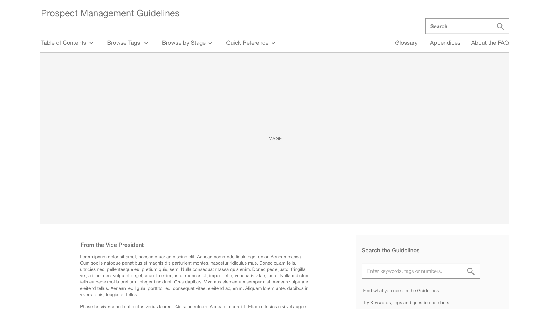 View full size
I created a low-fi clickable prototype and validated the navigation, search and browse flows with user testing.
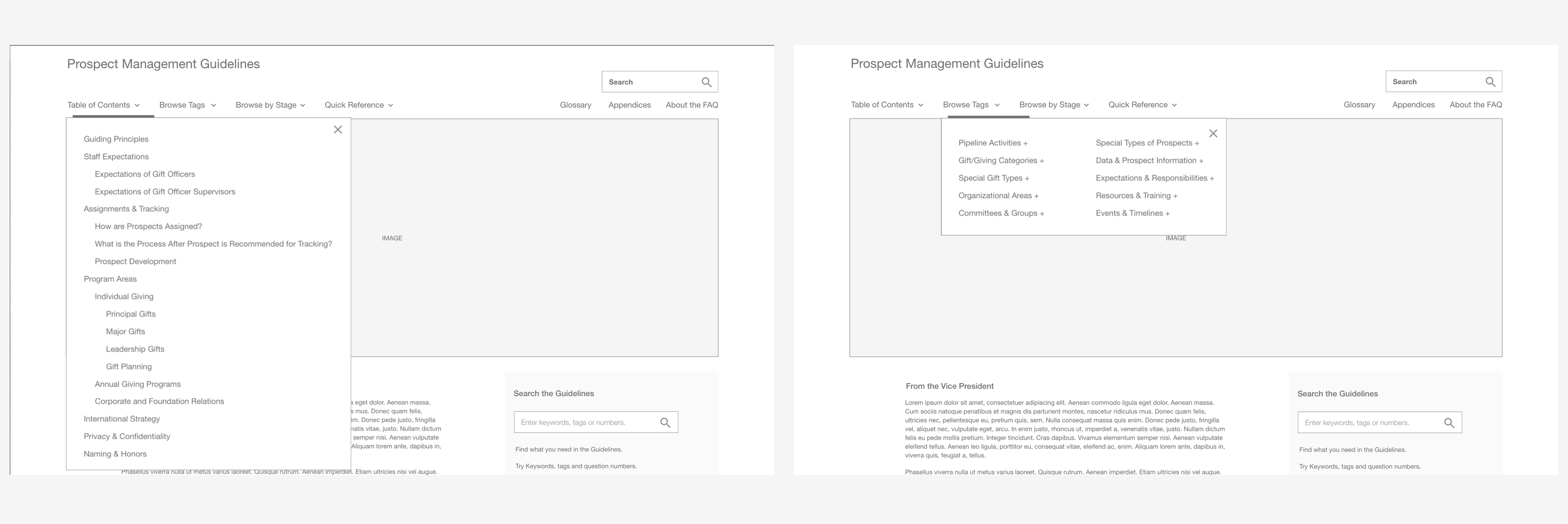 View full size
I included several pathways to the data to accommodate the different ways users could come to seek help from the document.
The designs are now incorporated into the university intranet. With the user-friendly navigational structure in place, Cornell's top-level fundraising veterans are helping to continually add tags and cross-links as needed so that the information stays relevant and accessible over time.